The challenge
In 2012, Superstorm Sandy had incredibly destructive impacts on New York City, with the subway system proving particularly vulnerable to a storm surge. New York City Transit (NYCT) commissioned Arup to improve the subway system’s resilience against future storm events.
Amongst other planning and rebuild projects, Arup engineers developed systemwide hydrological models to aid NYCT in capital planning and operational decision making. To assess the flood risk of major events across the entire subway system, the models incorporated tunnel geometry, pumping capacities, underground facilities, and individual flood vulnerabilities.
But delivering the flood model results as pdf documents would have resulted in the creation of 9,000 unique maps. Our challenge was to deliver the results in an interactive, web-based tool, that has the flexibility to ‘grow’ and integrate with the NYCT’s systems.
The tool
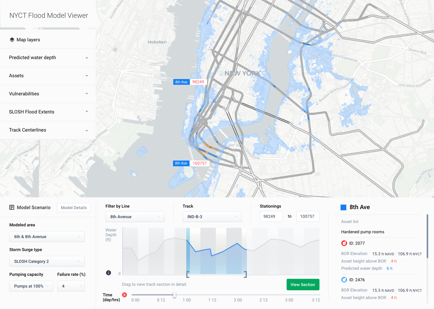
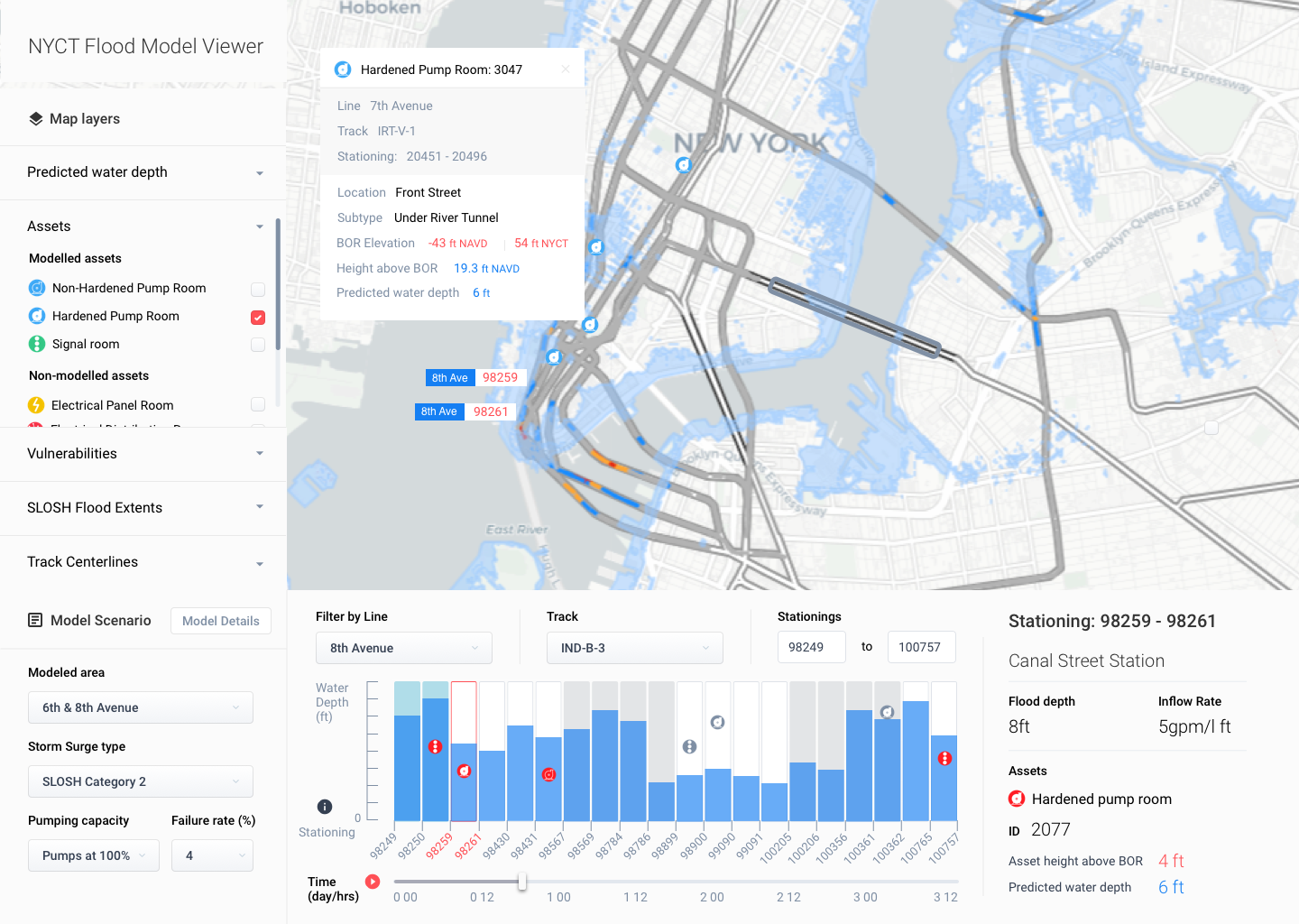
The NYCT Flood model viewer provides users with a color-coded map of the NYCT subway tunnels, depicting predicted flood depth and the position of different transit assets around the system. This allows the user to seamlessly get a system-wide perspective and have the option to drill down to specific areas of concern.
︎︎︎UX Design
︎︎︎UI Design
︎︎︎UI Design
My role
As part of a multidisciplinary team of hydraulic modellers, data scientists, GIS specialists and web developers at Arup, I worked closely with a user researcher, to understand the challenges faced by NYCT staff when accessing and analysing data while quickly responding to events.
I created concepts for the interface and user flows through the tool, that responded to the user needs identified through research. We went through several stages of prototyping and feedback, moving from low fidelity to high fidelity wireframes.
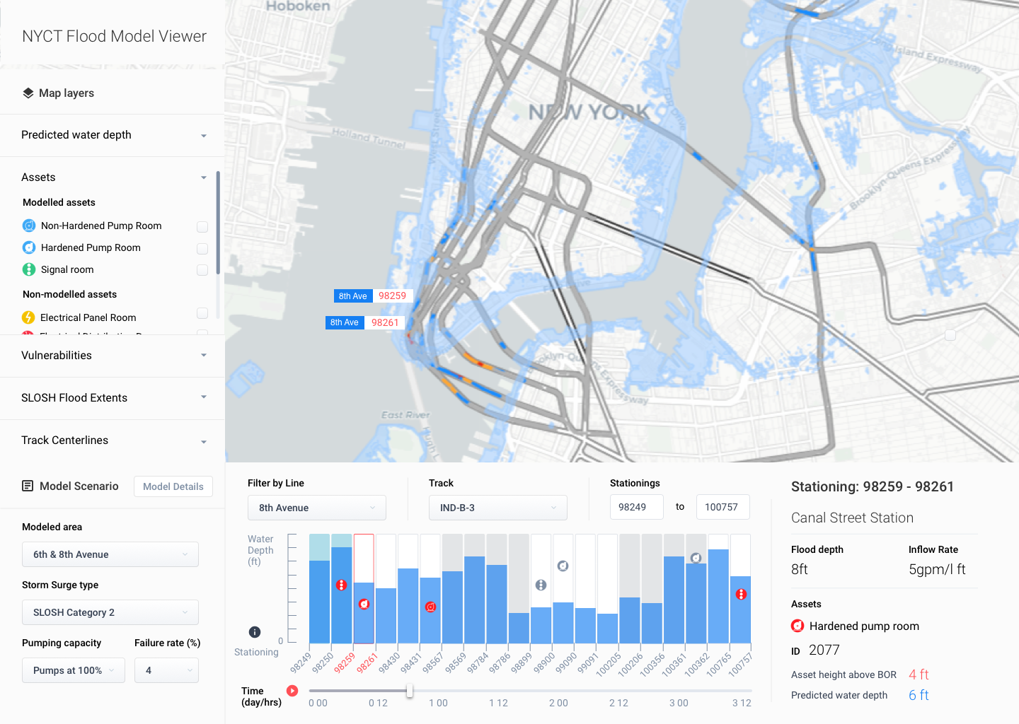
The challenge I had was to design an interactive chart that would allow an engineer to see how the entire subway line is affected, but then also be able to zoom in and focus on a particular section, and see a detailed analysis of the assets and vulnerabilities in that location. All this for several storm surge scenarios and with the ability to play out each storm scenario over a period of time.

Impact
The tool has been deployed on the client’s infrastructure for operational use and users are able to make critical decisions on immediate and long-term mitigation efforts.
The dashboard is both a capital improvement planning tool and an operational tool. It is helping prioritise areas of the subway system that need more attention and ensuring that all flood mitigation measures are activated in advance of a storm.


