The challenge
The transport planning industry is changing, in response to the new data available to inform decision-making processes.
Say you’re a city official and you’ve identified a need for a new metro route in your city. One of your big questions is: How do you cover the costs of building it?
Investment in public transportation tends to lead to land value increasing near stations. When you have a new station - the land value in the area around it increases, because that area is now better connected. There is potential to gain funding for new metro lines through something called land value capture.
So how does it work? Land value capture is a set of economic mechanisms through which government can borrow money against future increases in property tax, to fund the initial capital investment to build the infrastructure.
But conversations about land value capture occur too late on metro alignment projects, because in depth studies are time consuming, expensive and difficult to do collaboratively with stakeholders.
There is an opportunity to enable these conversations to happen earlier, at a high-level.
The tool
We experimented with creating a scenario building tool, which is map based and easy to use.
It allows the user to create and compare different versions of a rail alignment and explore the relation between costs and land value capture potential.
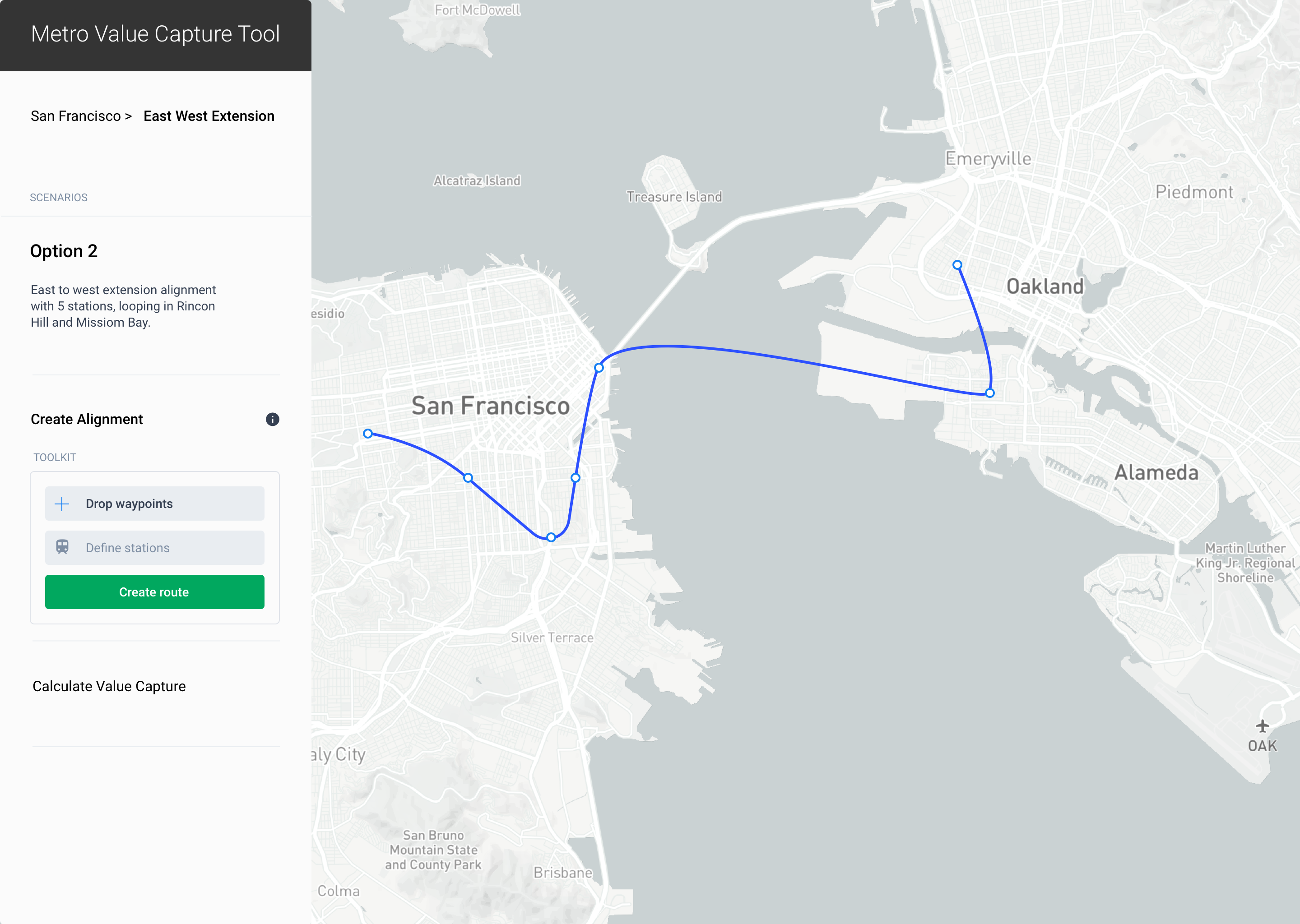
The first step is to plot the route, by dropping stations on the map.

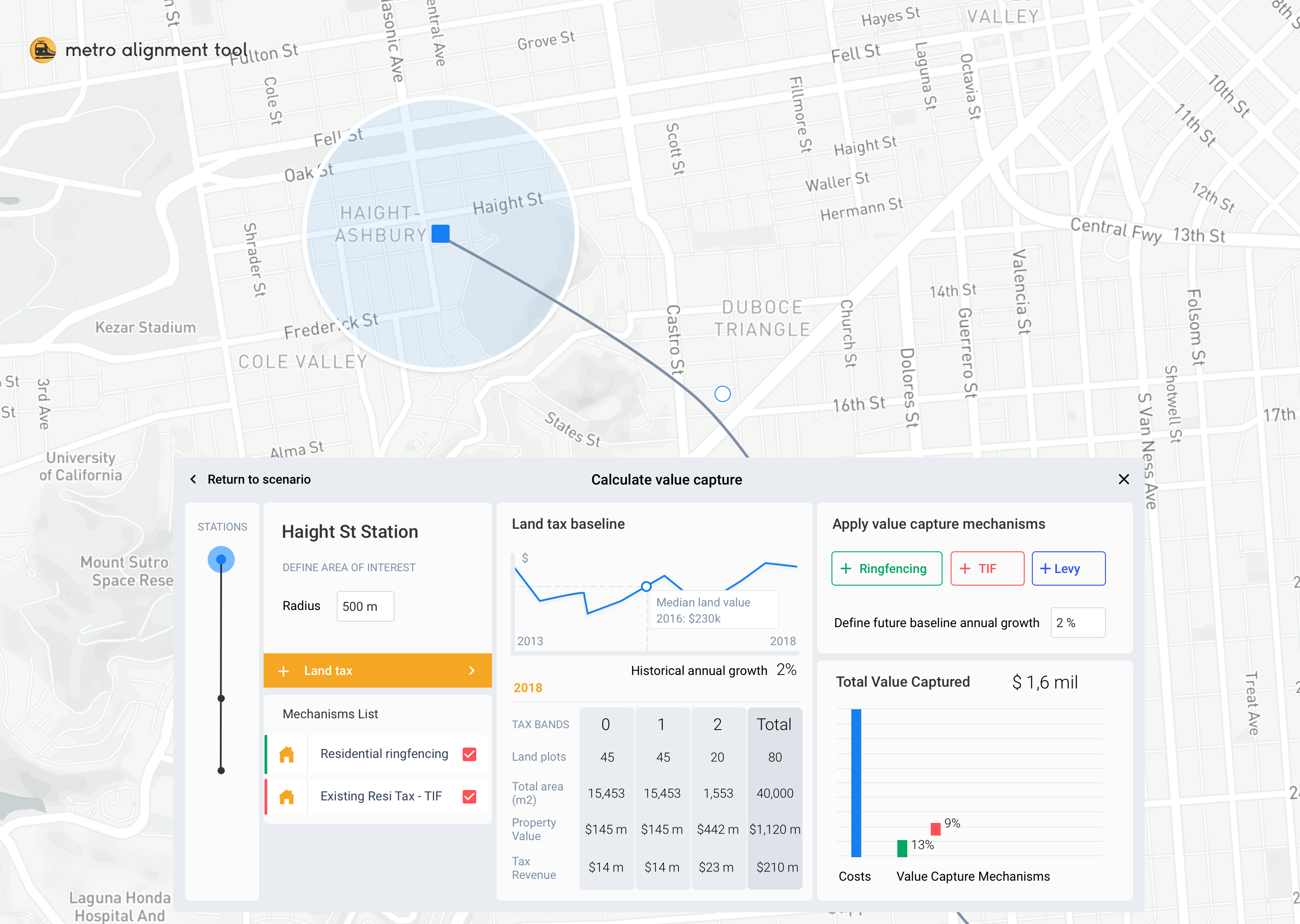
Next, the user defines a radius around each station and looks at historical data around land and property tax. Different economic mechanisms can be applied to that area, to build up a chart that shows how these stack up against the cost.
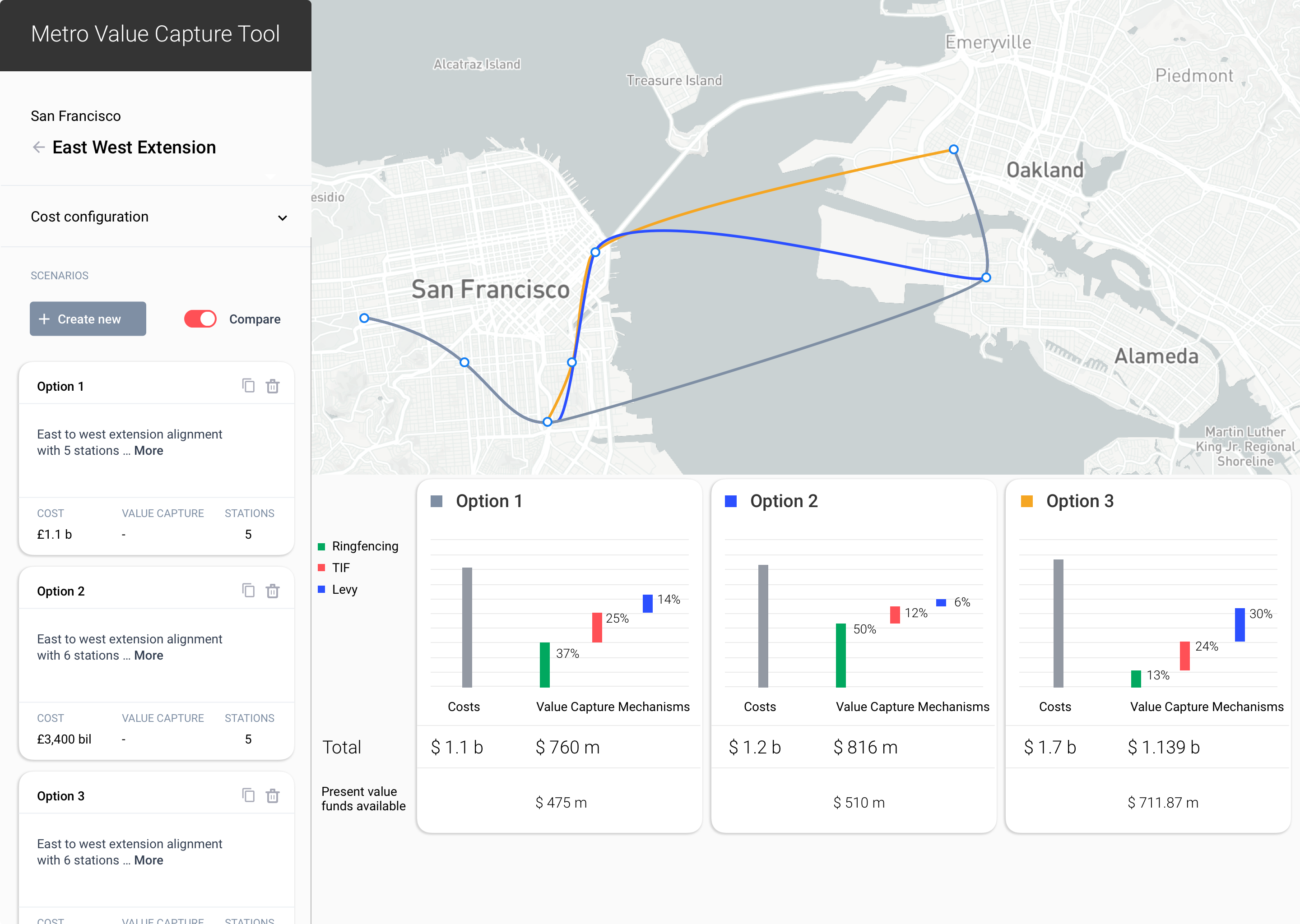
Once the scenarios are created, they can be compared, to see how they stack up against eachother.
︎︎︎User interviews
︎︎︎Insight synthesis
︎︎︎UX design
︎︎︎UI design
︎︎︎User testing
︎︎︎Insight synthesis
︎︎︎UX design
︎︎︎UI design
︎︎︎User testing
My role
I led a multidisciplinary team through discovery exercises to understand the problem area. Working with transport planners and economists through co-design activities, I developed iterations of interfaces and mapped flows of how the user would move through the tool, prioritising key interactions.
The challenge was finding the right level of detail. The economist on our team was used to looking at this analysis in great detail. And at the beginning she was trying to integrate all of those calculations into the tool. But we weren’t trying to replace the full blown economics study that happens at a later stage in the process. We were trying to enable an early, high level conversation. Between her, the transport planner and the city official, both of whom were not experts in her field.

“
This whole exercise, and this process helped me to switch my thinking, and realise that things that are clear to me, might not be clear to my clients. So it just reminded me to keep asking - what is it that really matters and what is less important.
It’s important to prioritise things.”
Arup City Economics team member
Lessons learned
There is an opportunity to create new ways of interacting with data that are visual and place based, that enable people to take decisions based on data they understand and situate better.
When you’re working at the intersection of different disciplines, the common language can be visual. The right interaction can be the glue between disciplines that supports understanding.